AIRASIA
User Experience Consulting
Usability Testing for Mobile App Redesign
2016
AirAsia redesigned their mobile app and wanted to evaluate the usability of the new app. The focus of the study was to understand the challenges faced by the user, and identify areas of improvement to enhance the flight bookings and management journey experience.

The usability test was conducted in Malaysia in a 1-to-1 method using eye tracking technology. The mobile app was tested on current AirAsia customers: one group has used the app before (previous design), another group has not used the app. Each respondent was asked to complete a series of tasks, followed by a retrospective think aloud interview to understand their behaviour when performing the tasks.
The usability study of the user journeys on two different user personas during a usual flight booking and management process uncovered key user experience issues that hindered a smooth booking journey. Appropriate design recommendations were made to improve the user experience of the mobile app.

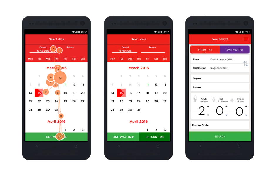
Left: A single green button shows at the bottom of the screen. If only a “depart”date is selected, the “One Way Trip” button is shown. If a “return”date is selected after as well, then the “Return Trip” button is shown. The problem is, once a user selects their “depart”date, even if they are planning for a round trip, they get confused by the “One Way Trip” button. Some cancel and restart the process, only to be met with the same roadblock again.
Middle: Consider putting both “One Way Trip” and “Return Trip” buttons at the bottom, with only one button active at a time. If only “depart” date is selected, “One Way Trip” button is active. If “depart” date and “return” date are selected, “Return Trip” button is active.
Right: Consider setting the scene for users to consciously be aware of selecting for a one way trip or round trip on the first booking screen.

Left: Messaging in the app confused users. Such as the ambiguous “Slide left and right to navigate” to the pointer icon not indicating what the user is navigating.
Right: Revise messaging to be clear and concise to users. Adjust the position of the pointer icon to indicate what the user is navigating.

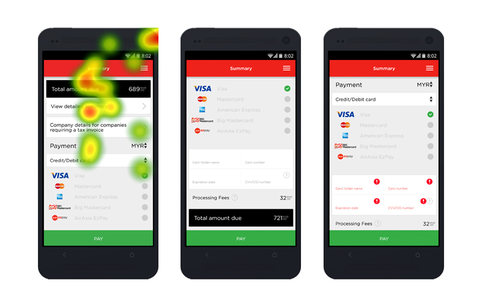
Left: There is no indication to the user to scroll on this page to complete their payment. Some users thought that clicking on the “Pay” button will lead them to the next page to fill in their credit card information.
Middle: The credit card fields are hidden to users. In addition, if the user does not fill in the fields, there is no indication that the user has not filled in those fields and hence cannot proceed with payment.
Right: Consider having clear error messaging indicating missing information that is required from the user. Grey-out the “Pay” button so the user is aware that it is inactive and they cannot proceed until they fill in all their information, which hints that there is additional information if the user scrolls.
