IHG
Art Direction for Brand Identity
“Real Guests, Real Reviews” Badge Redesign
2015

On all IHG brands websites, only guests with verified stays at any IHG brand hotels can post reviews and rate their experience. This ensures that all opinions expressed, positive or negative, are coming from guests who have stayed at the hotel.
Unfortunately, the current design of the “Real Guests, Real Reviews” badge lacks visual appeal and does not command the authority of a seal of approval. Moreover, the small type in the outer arc is not legible and thus does not convey the full message.

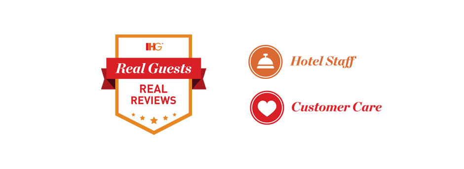
The redesigned badge takes the form of a new shape: the shield. This represents the trustworthiness of the IHG family of brands. The messaging has been revised to feel friendlier and more conversional, while informing users that verified guests wrote these reviews.
Instead of a flat grey, the badge wears the core IHG colours: orange, mango and cherry. This allows the new badge to stand out on the page, and at the same time be able to be displayed across all brands, reinforcing IHG brand awareness. Other special elements include the ribbon to be used for emphasis, and stars to denote quality. (Badge featured on Crowne Plaza above.)

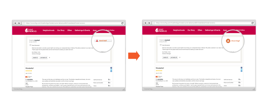
Also redesigned are the “Hotel Staff” and “Customer Care” icons, giving it a fresh and customised look that speaks to the IHG brand. These icons will also appear on the reviews pages, and replace the default generic grey button icons.


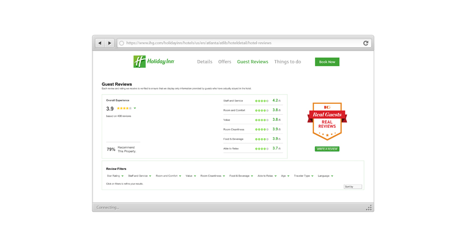
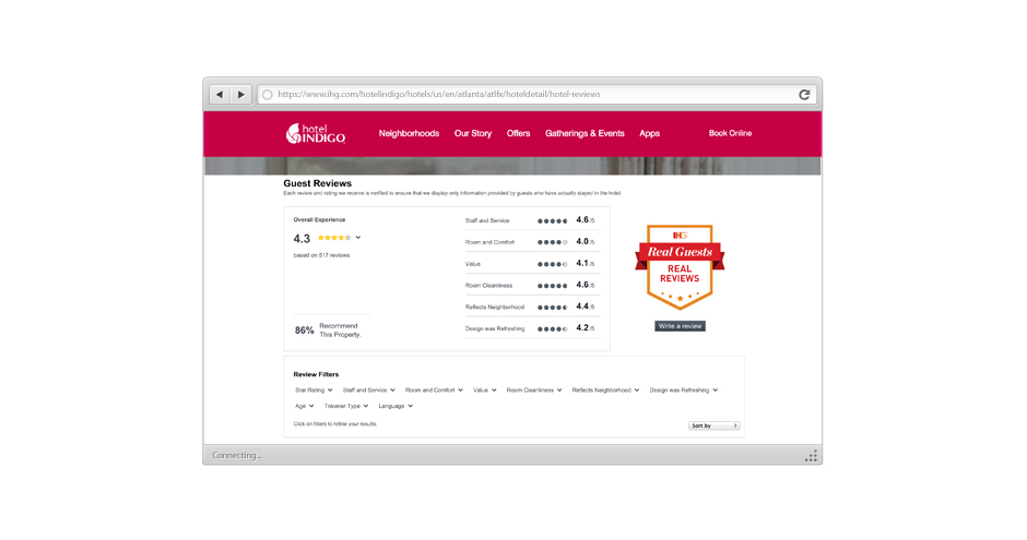
“Real Guests, Real Reviews” badge on Holiday Inn and Hotel Indigo websites below.


